Grubhub Digital App: UX Case Study & Redesign
Purpose:
The purpose of this study is to analyze and improve the user experience when using the Grubhub mobile application by updating the restaurant browsing experience, providing a quick way to view menus and add more user friendly options to search and filter for different cuisines.
Background:
Grubhub is a leading online and mobile food-ordering and delivery marketplace with the largest and most comprehensive network of restaurant partners. Grubhub features over 300,000 restaurants and is proud to partner with 265,000 of these restaurants in over 4,000 U.S. cities. The Grubhub portfolio of brands includes Grubhub, Seamless, LevelUp, AllMenus and MenuPages.
Company Statistics:
Provided nearly $9 billion in gross food sales to local takeout restaurants in 2020
Processes more than 658,000 daily orders
Serves 31 million active diners
Sent more than $4 billion in total tips to drivers to date
User Observation & Testing
Five users in the target demographic were asked several questions and asked to complete a task over video chat. Users were provided questions prior to their video chat. While on the chat the users were asked to talk through their process from choosing a restaurant, selecting menu items, and checking out.
User Interview:
Do you order delivery on a frequent basis?
What is your preferred method of ordering food?
What is your preferred service when ordering delivery and why?
What challenges do you encounter while using the delivery app?
What options do you look at when ordering online?
User Task:
I asked the user to search for a local restaurant in their area. The were to select an appetizer and main dish.
They had parameters of choosing a restaurant of Asian cuisine.
They needed to choose a restaurant that is offering free delivery.
They would need to choose a restaurant with the fastest delivery option.
The Problems, Justification & Solutions
Problem 1: Restaurant Browsing Experience
The search option for browsing restaurants is not being used effectively. The viewing of the restaurants is overwhelming. The user is taken away from the main screen to search for specific cuisines. Once the user has chosen their cuisine, they are faced with a high volume of options to scroll through.
Justification:
• Users were not able to immediately identify how to locate different cuisines.
• Users were faced with a high volume of options that brought on multiple pages of scrolling.
Solution:
The goal is for the user to do as little work as possible. We added the different cuisines at the top of the homepage of the mobile application and readjusted the layout of the restaurants to make the information easily accessible and readable.
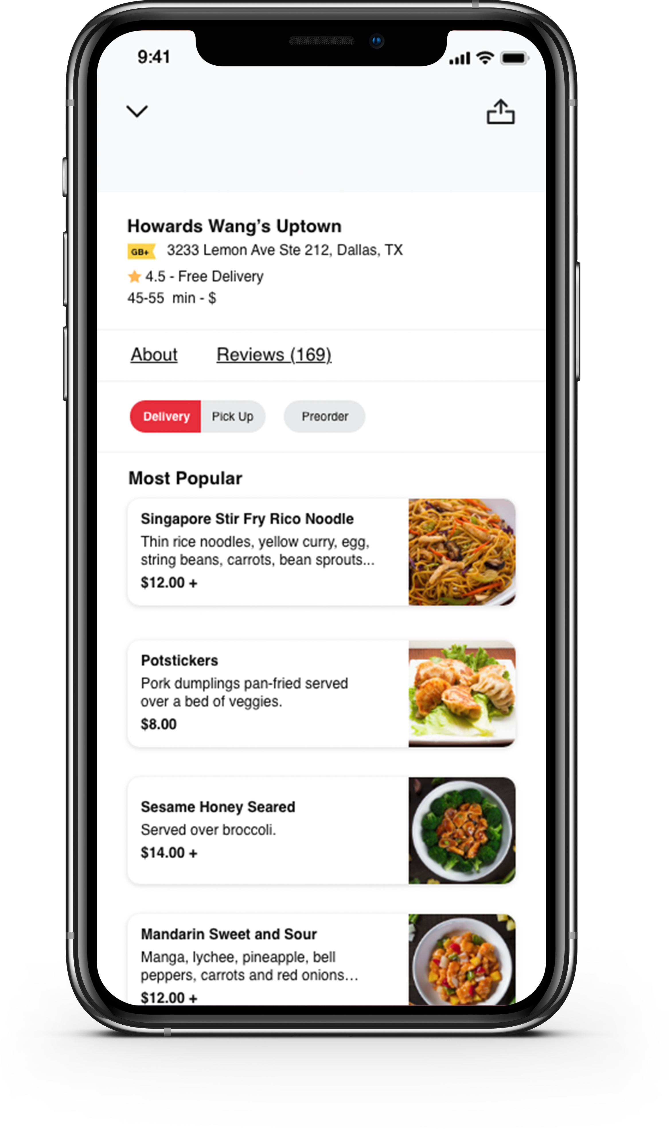
Problem 2: Scan-Ability of the Menu
The inefficient usage of space. The user has to continuously scroll up to 3-4 (depending on the restaurant) screens in order to view the full menu.
Justification:
• Users were overwhelmed by the choices. Some users spent over 5 minutes locating something they wanted.
• Users went through multiple pages of scrolling.
• The design feels tight. There is no distinction between the different menu items.
Solution:
To avoid having the users scrolling through multiple pages, we added a filter option at the top. This is a carousel menu, the user can slide through choosing the different options. We also added a drop-down menu with the same functionality.
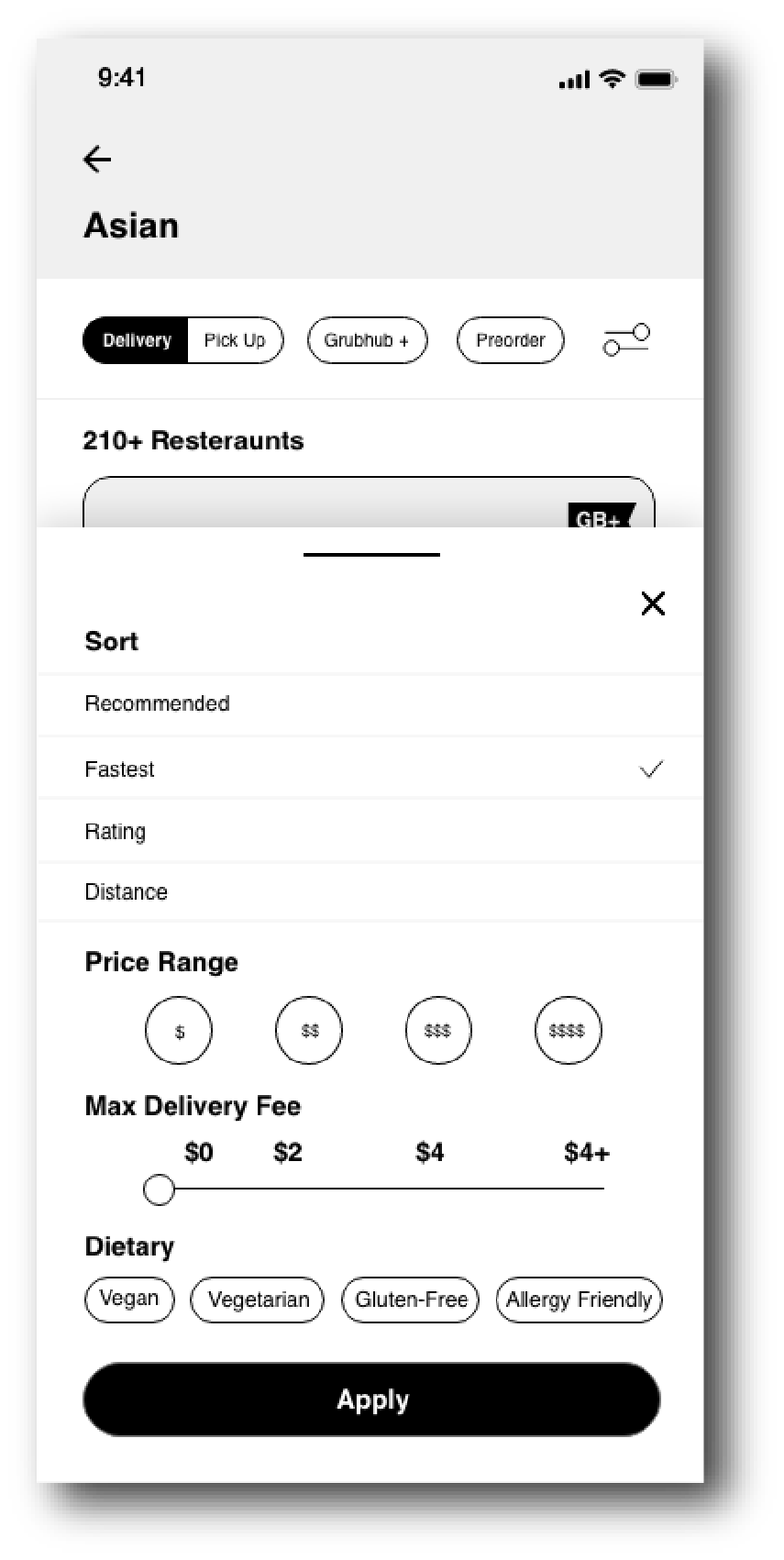
Problem 3: Lack of Filters
Lack of filters, when the member searching for a restaurant, the only is option is to sort. The user is unable to select different sort options and is forced to choose one.
Justification:
• Users do not have the option to filter for delivery cost.
• When asking the users what options they looked for when ordering food delivery, all users stated they look at the delivery cost.
• The users wanted to filter for cost of food, the delivery time, and the delivery cost.
Solution:
We simply expanded the sort function. We kept the delivery/pickup, Grubhub+, and Pre-order buttons on the main screen since those are most important. We then added a filter tab on the right where a drop-down will pop up. The user will have the option to sort and filter.
Wireframe:


Prototype:
Feel free to view the prototype here.
Final Design: